

Trully buzzing experience!
Designing jar labels for a Czech honey company was an exciting and fulfilling experience. My goal was to create a design that not only captured the essence of honey but also reflected the brand’s values and aesthetics.
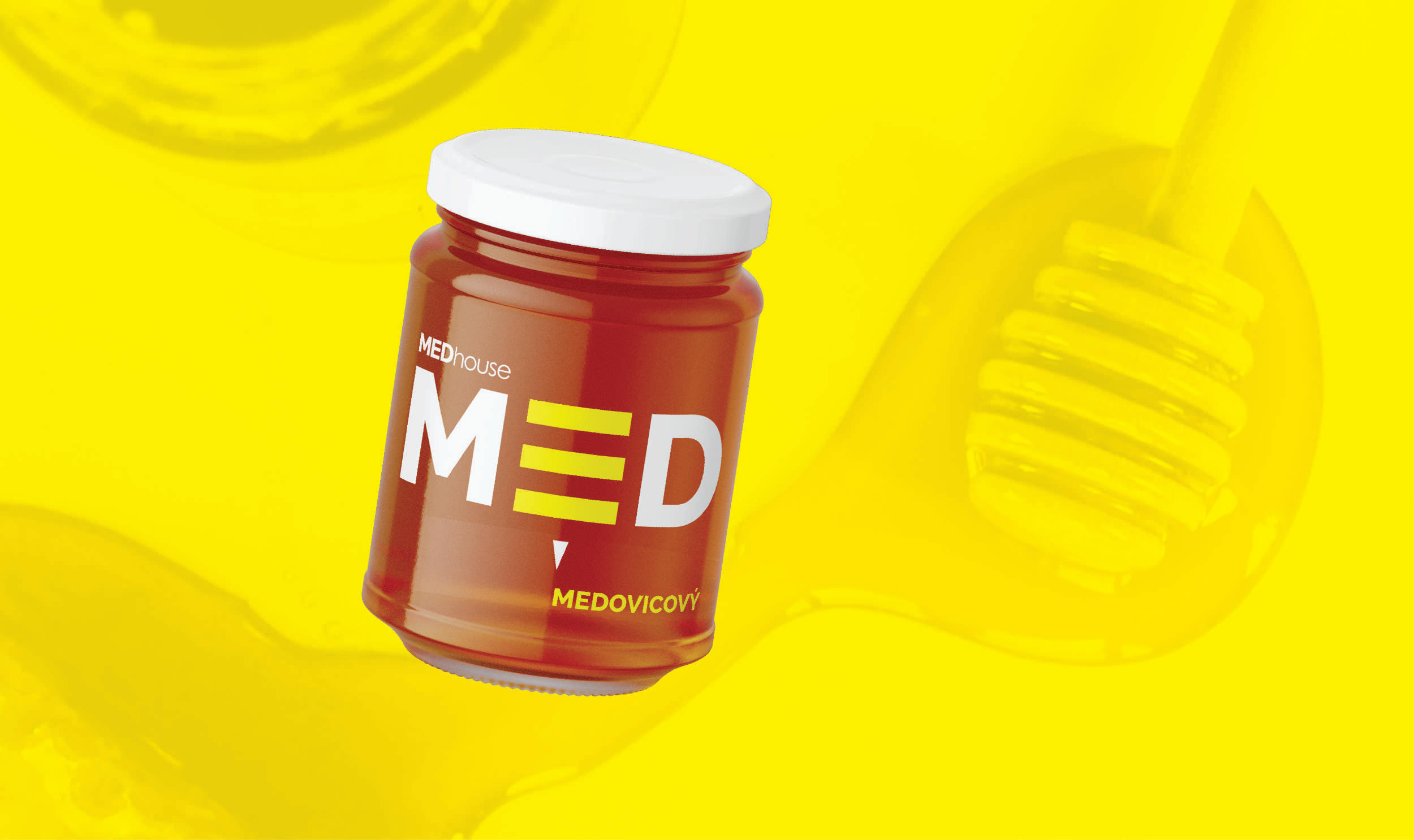
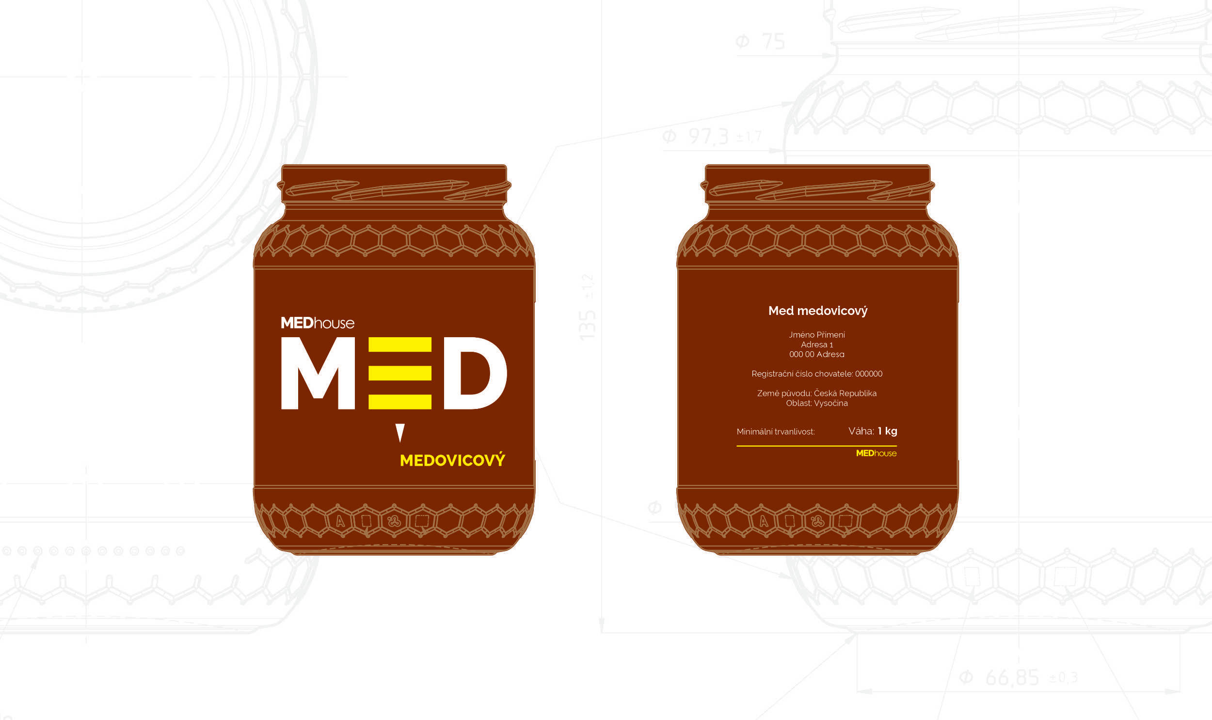
The main design element, a stylized word “MED,” played a crucial role in conveying the message of this product. I wanted it to be more than just a word – I wanted it to be an embodiment of nature’s tiny miracle workers: bees.
To enhance the connection with honey and bees, I chose a vibrant yellow color for the label, reminiscent of golden honey itself. This color not only catches the eye but also evokes feelings of warmth, joy, and sweetness.
In line with the company’s vision for simplicity and cleanliness, I opted for a minimalistic approach in typography. The clean lines and uncluttered layout allow the focus to remain on the stylized “MED” bee motif while maintaining readability and elegance.
By combining these elements – the bee-inspired typography, bright yellow hue, simple layout – I successfully created jar labels that not only stand out on shelves but also evoke emotions associated with pure, natural honey.
Designing these labels was more than just creating visually appealing packaging; it was about capturing the essence of this company’s commitment to quality and authenticity. Through thoughtful design choices, I aimed to convey their passion for delivering exceptional products straight from nature’s buzzing kingdom.
