
In search of harmony.
Let me take you on a journey of how I crafted the entire brand identity of a piano courses Jihoceske Klavirni Kurzy, from its captivating logo to its stunning advertising materials.
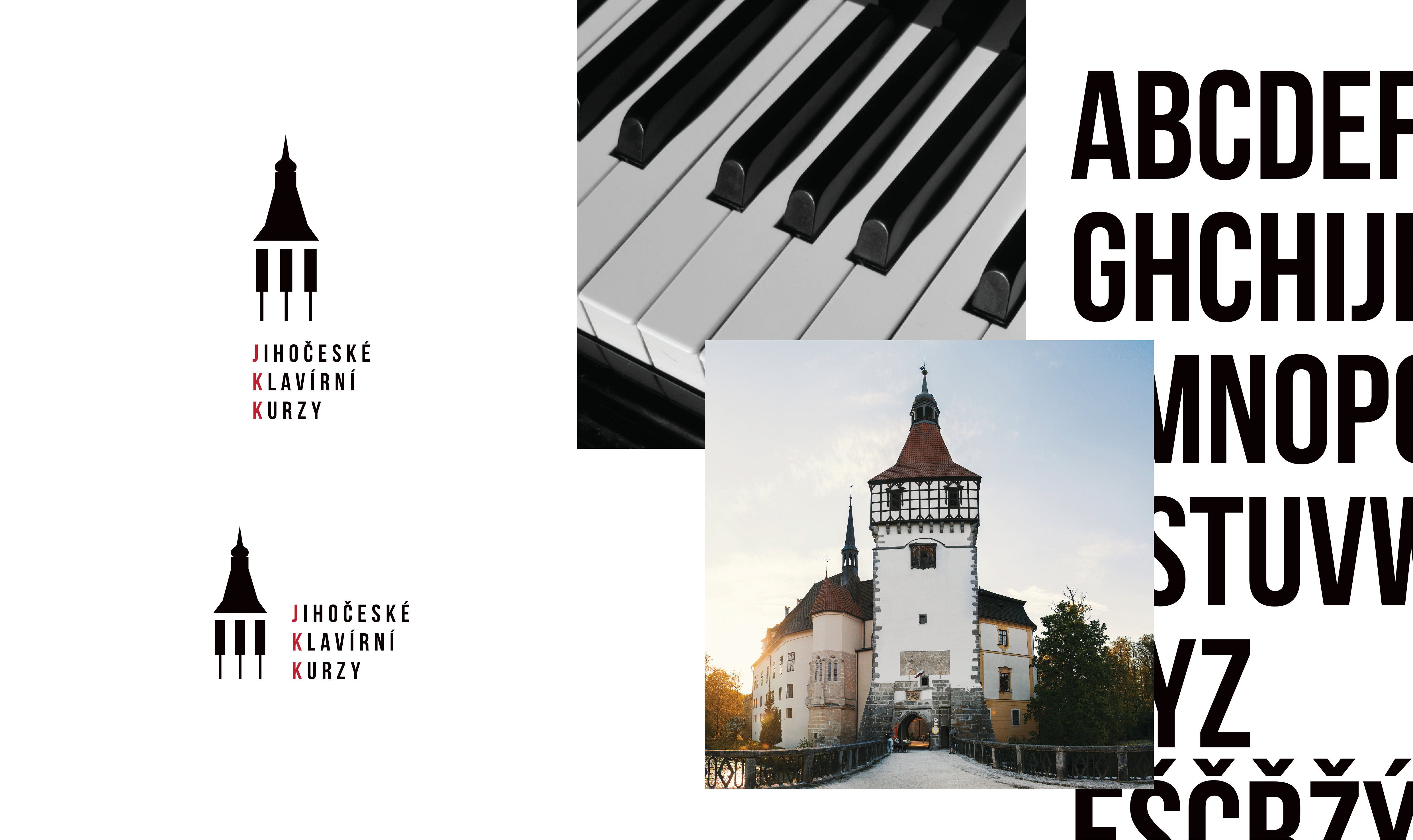
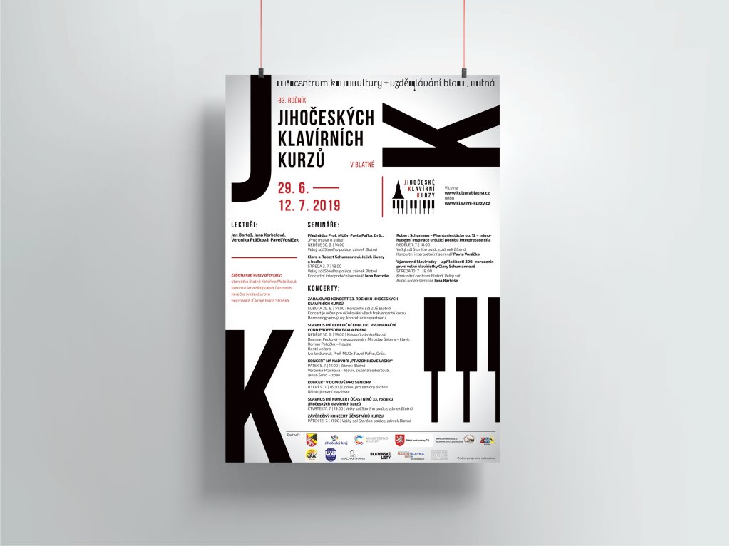
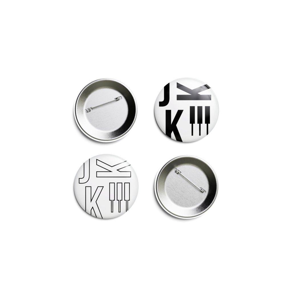
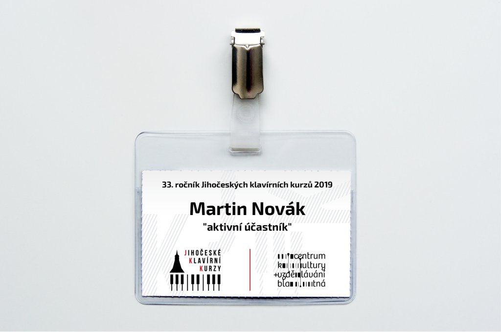
When I first embarked on this project, I knew that the essence of JKK had to be captured in every aspect of its brand design. The piano, being the heart and soul of their music courses, became the focal point of inspiration for their logo.
With great passion and attention to detail, I incorporated elements of a piano keyboard into the logo design. The keys symbolize not only the musical foundation upon which JKK is built but also evoke a sense of elegance and sophistication.
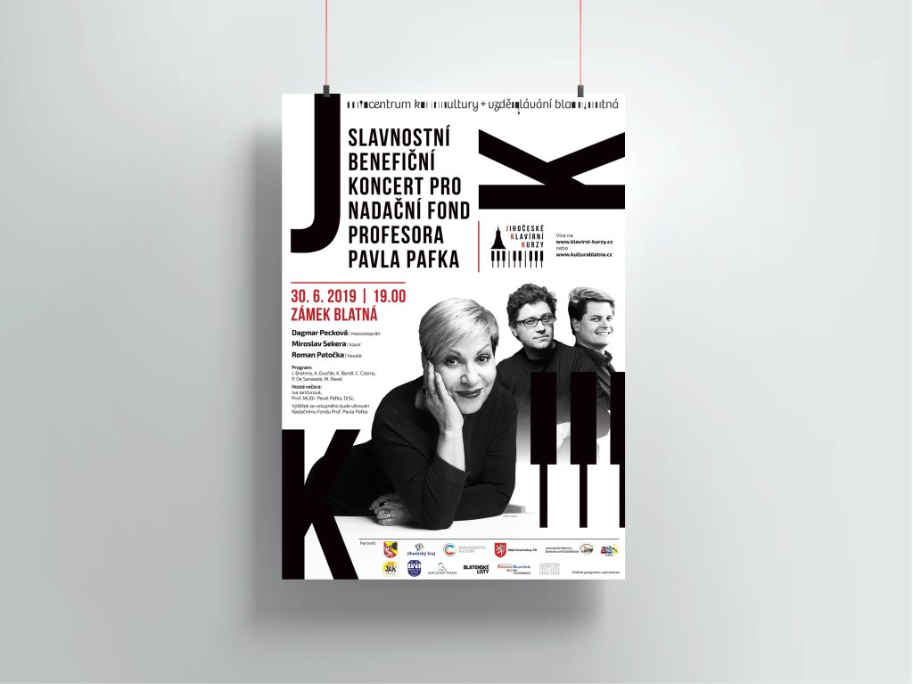
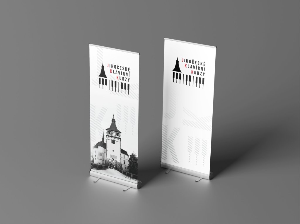
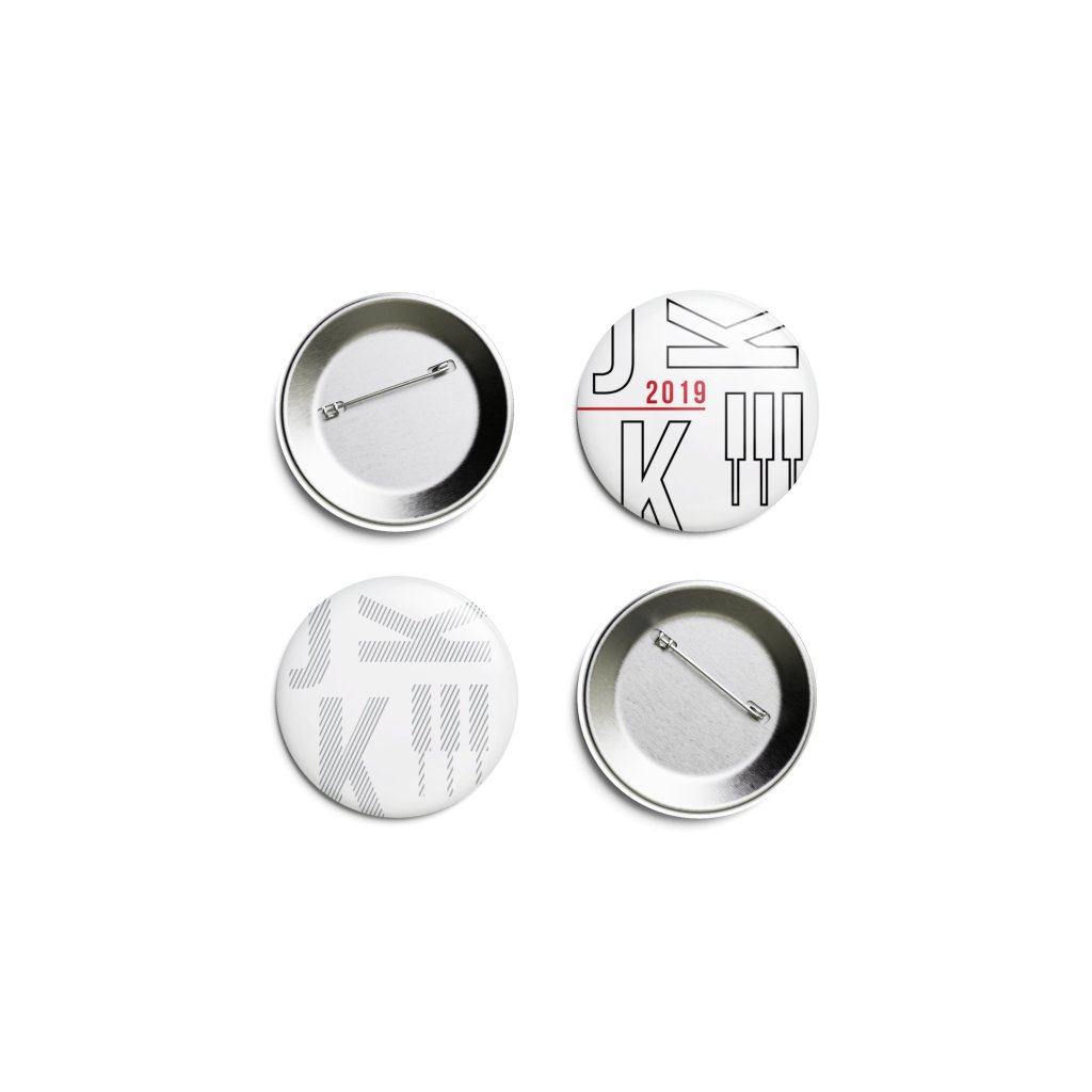
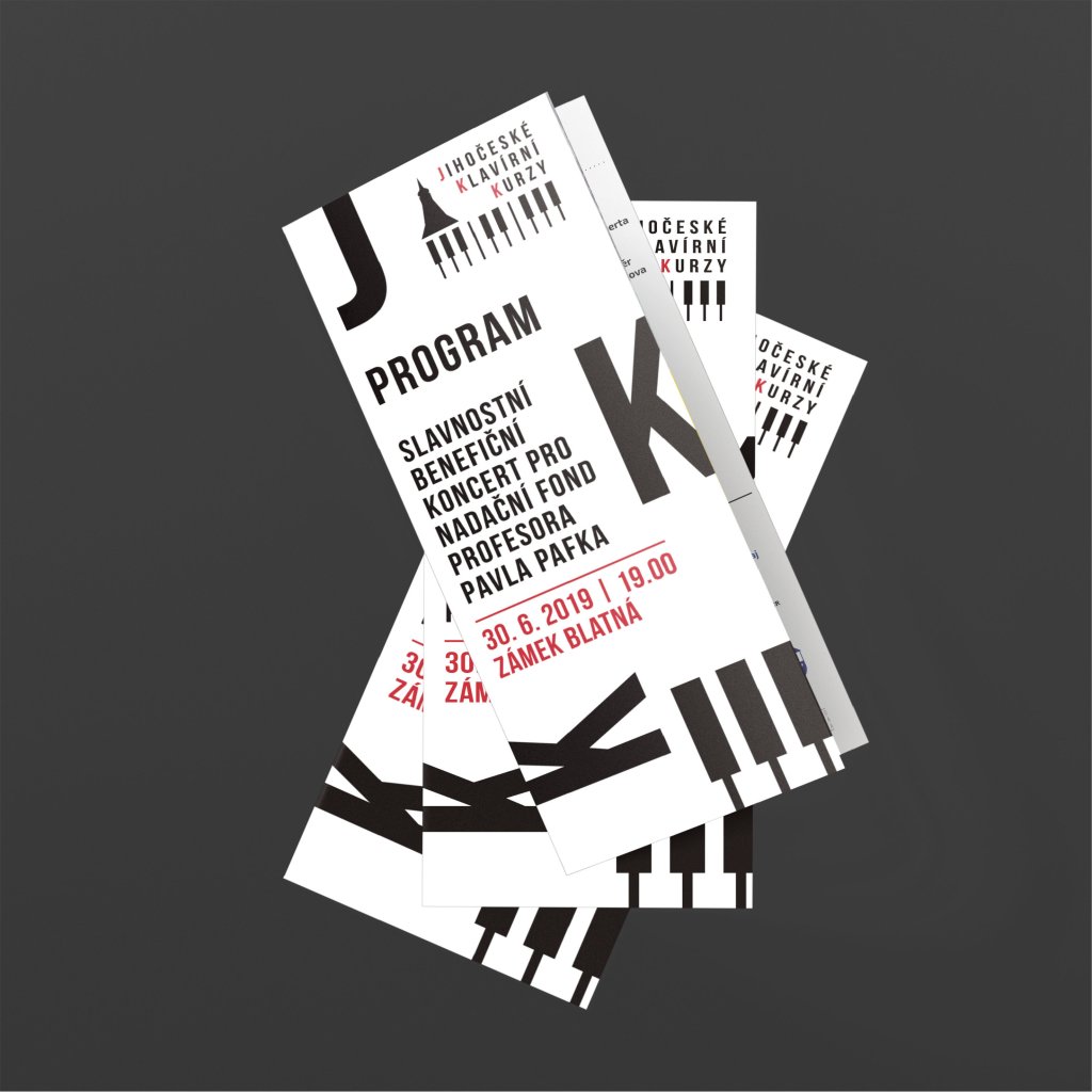
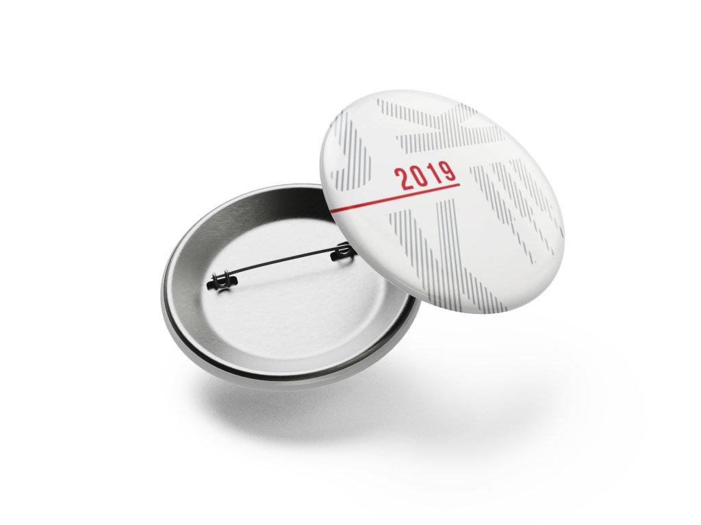
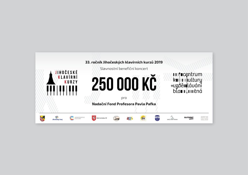
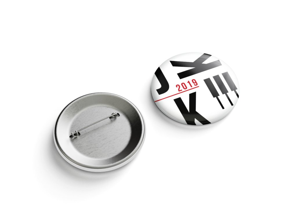
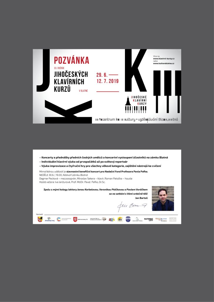
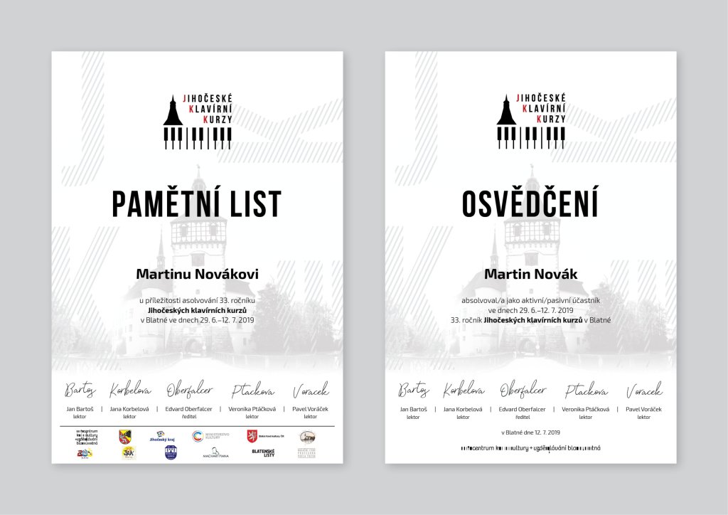
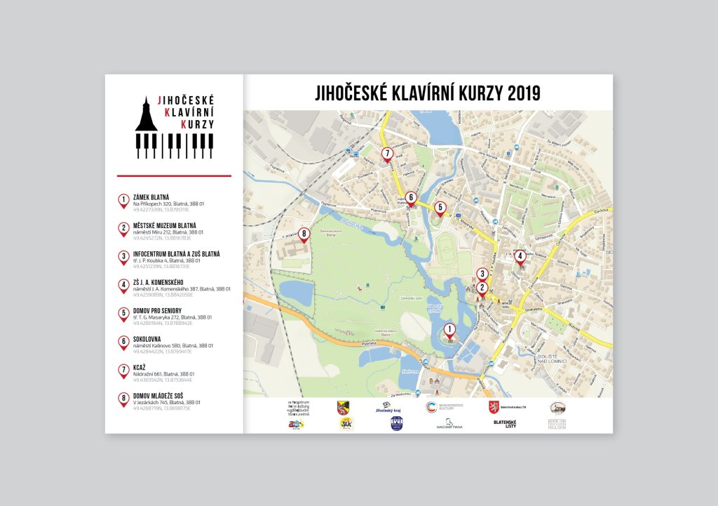
But my work didn’t stop there. To truly bring this brand identity to life, I carefully crafted all advertising materials for both print and digital use. Each piece was thoughtfully designed to reflect the unique personality and values of JKK.
From brochures that showcased the diverse range of courses offered, to eye-catching banners that promoted upcoming events, every element was infused with creativity and purpose.
The result? A cohesive brand identity that resonates with both aspiring musicians and music enthusiasts alike. It’s a visual representation that speaks volumes about JKK’s commitment to excellence in music education.
Crafting this whole brand identity has been an exhilarating journey filled with passion and creativity. It is an honor to have played a part in bringing JKK’s vision to life through captivating design elements inspired by the timeless beauty of the piano.
