

Carefull, fragile!
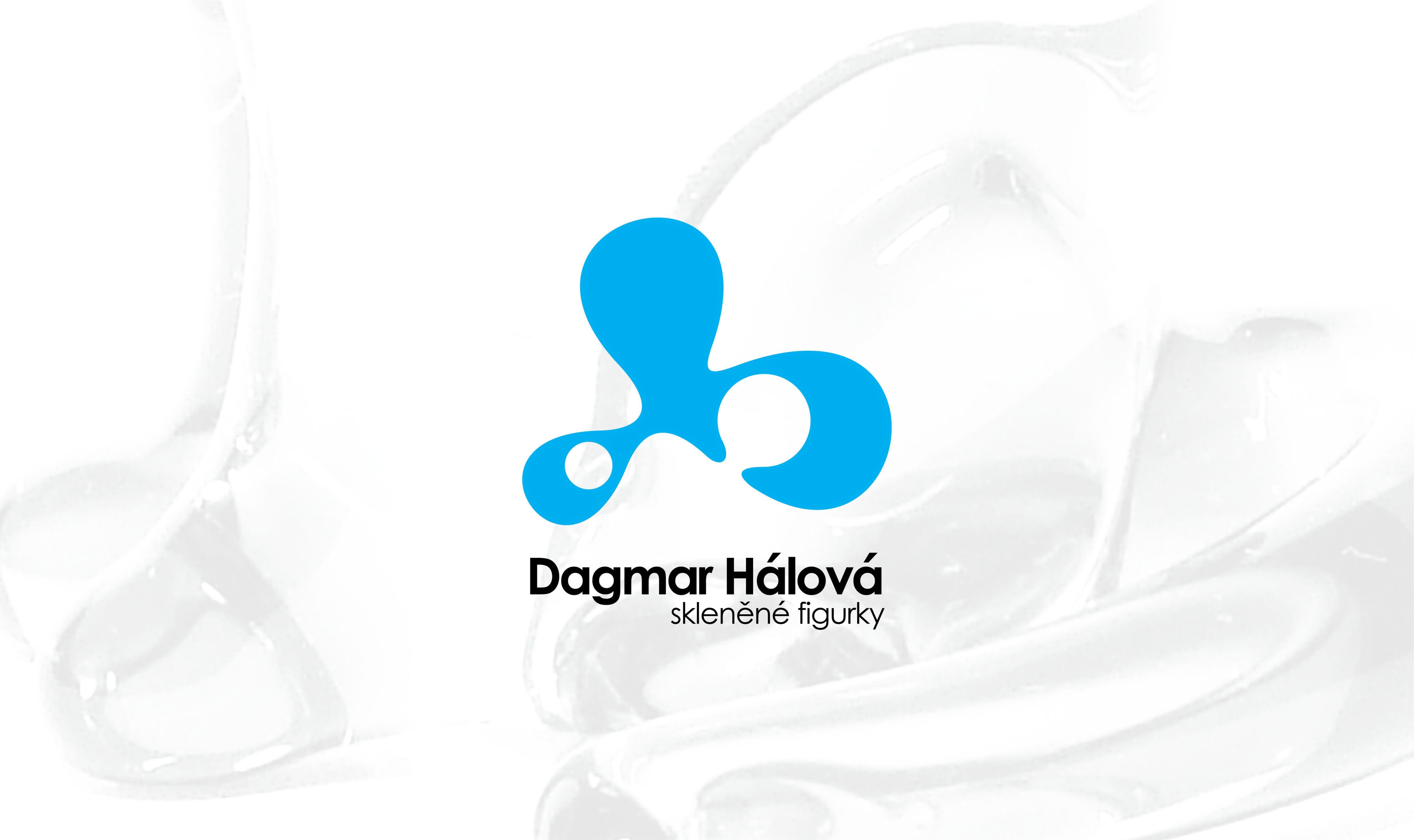
In the captivating world of brand identity design, I had the incredible opportunity to work with a talented glass figures maker – Dagmar Halova, zeskla.cz. A visual representation that truly embodied the essence of glass – its fluidity, form, color, and undeniable elegance, was an ultimate goal here.
The first step was crafting a logo that would serve as the cornerstone of this brand’s identity. After countless sketches we settled on a design that captured the graceful curves of glass. The logo became a symbol of artistry and craftsmanship.
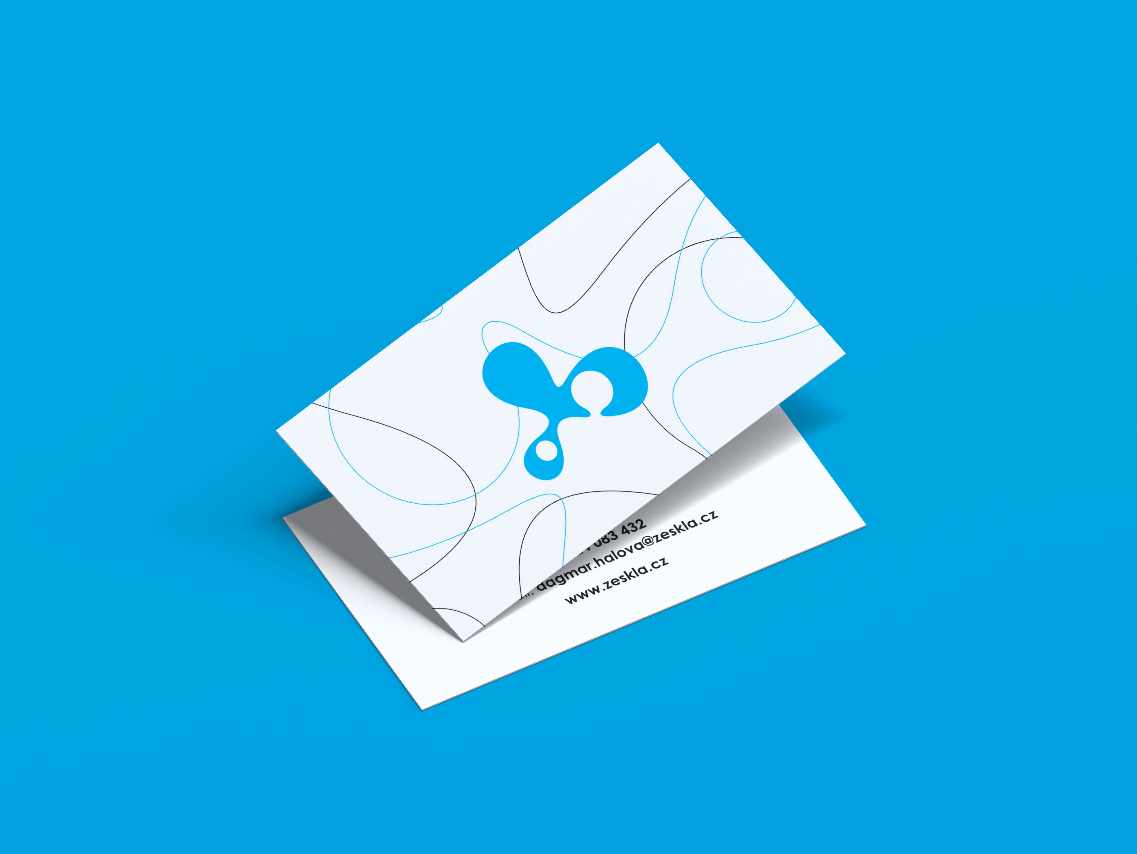
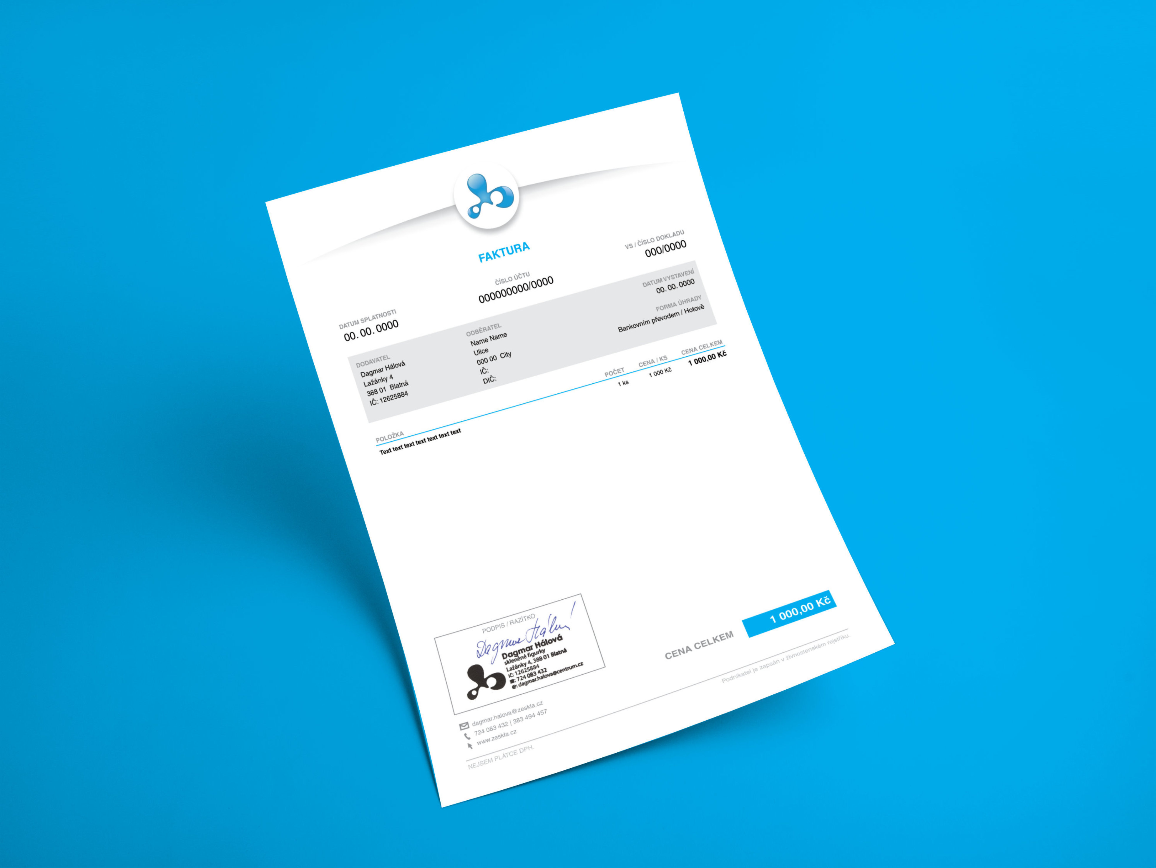
Next came the challenge of translating this vision into tangible elements such as business cards, invoices, and mainly packaging. Every detail was carefully considered to ensure cohesiveness and an immersive experience for customers. When it came to packaging, we opted for minimalist yet sophisticated boxes adorned with subtle embossed patterns that mirrored the flow and movement inherent in glass artistry.
