

Building a brand, literally.
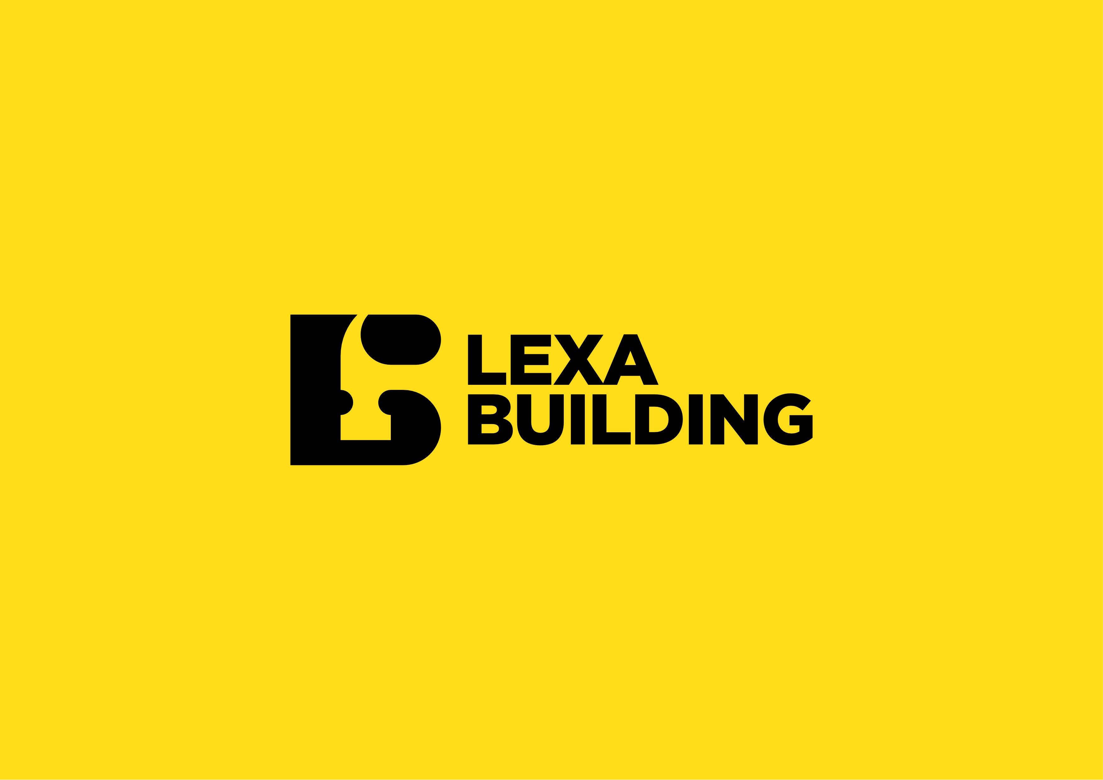
The visual identity of Lexa Building, a dynamic construction company, was an exhilarating creative journey that began with the inception of a bold logo. The challenge was to encapsulate the essence of construction while reflecting the company’s initials, ‘L’ and ‘B.’ The result was a powerful logo where the sleek fusion of the letters seamlessly formed the head of a hammer. This dual symbolism not only visually represented Lexa Building’s identity but also conveyed the core principle of construction at the heart of the brand.
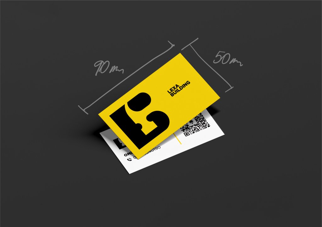
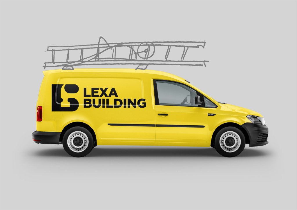
The bold logo was just the starting point; it ignited a domino effect across all brand touchpoints. From business cards to invoices and even the car wrap, every aspect of Lexa Building’s visual communication exuded a consistent and impactful design. The logo’s boldness was mirrored in a striking color palette that echoed the strength and reliability associated with construction. This comprehensive approach to brand identity not only gave Lexa Building a distinct visual presence but also conveyed a message of strength and precision to clients and partners, setting the stage for a powerful and memorable brand experience.
