


Reach the peak!
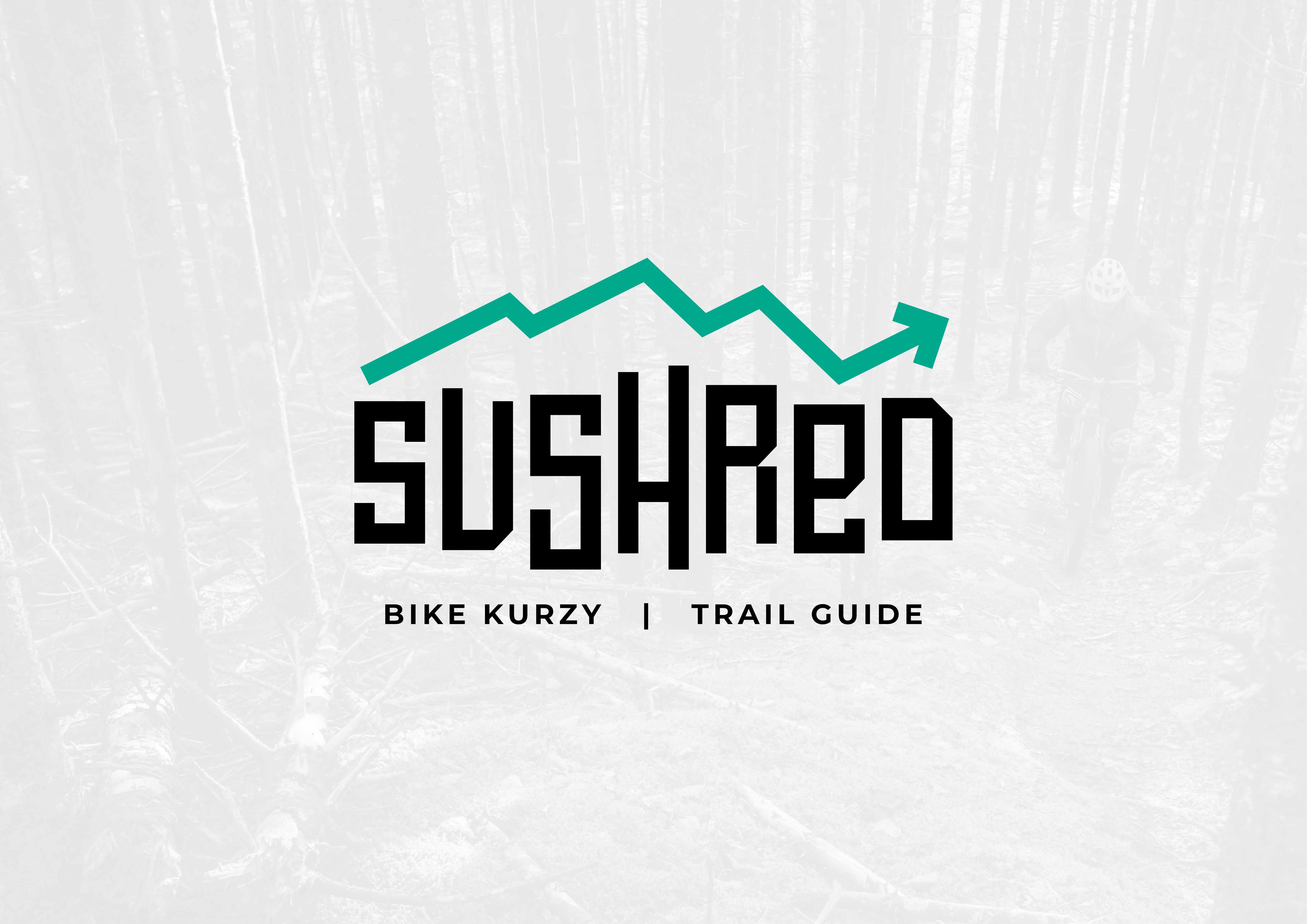
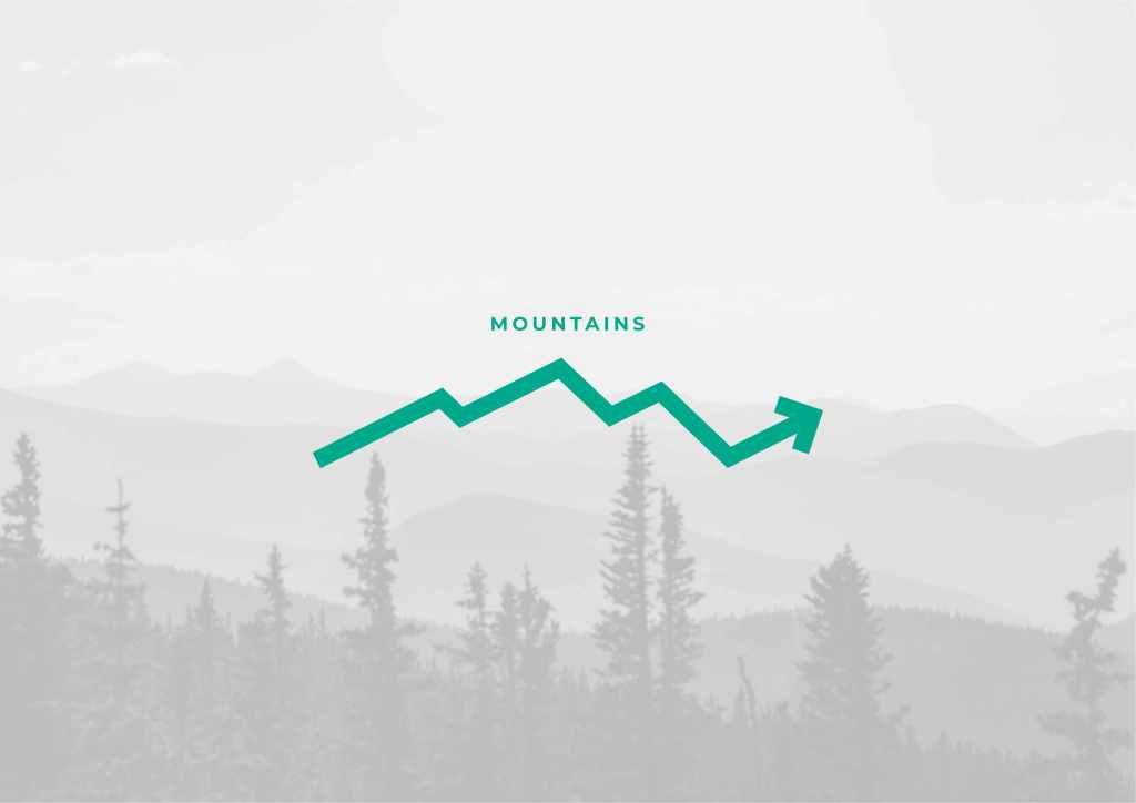
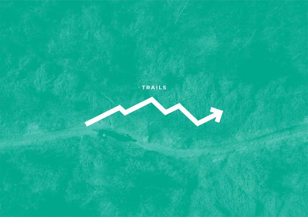
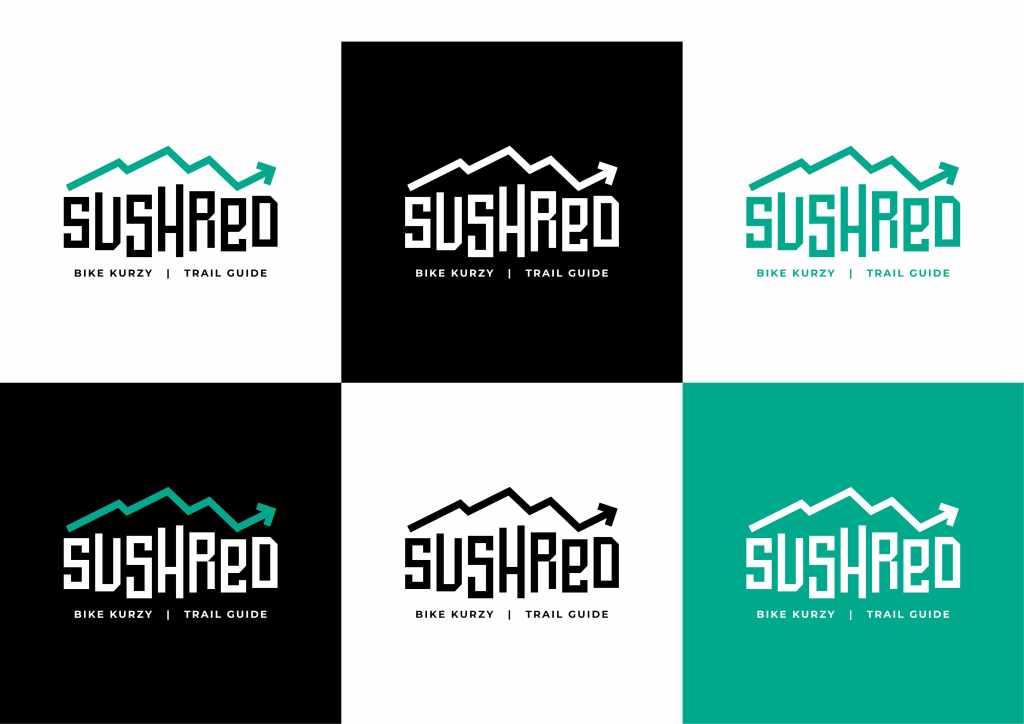
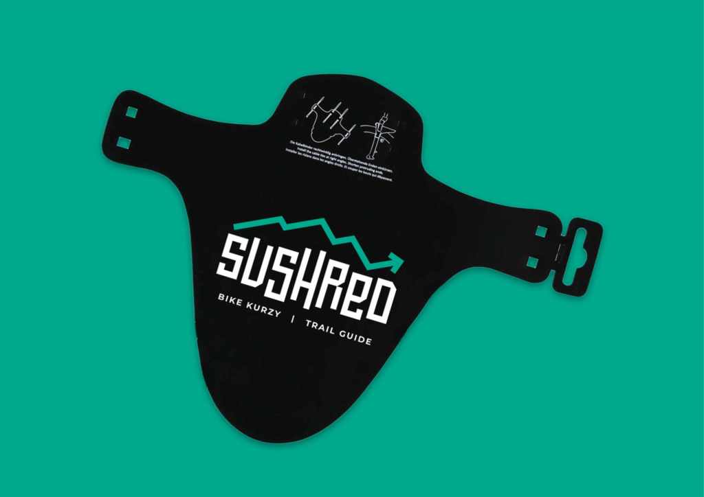
Crafting a unique brand identity for a bike instructor and guide was a thrilling challenge that led to the creation of a logo that stands out in the world of cycling enthusiasts. The goal was clear – to encapsulate the essence of progression, the thrill of mountain biking trails, and the majestic presence of mountains. The logo seamlessly weaves these elements together, with the silhouette of a mountain bike trail forming a continuous, upward progression. This visual metaphor not only represents the instructor’s dedication to guiding riders on an upward journey of skill development but also captures the exhilaration of conquering challenging trails.
The incorporation of mountains into the logo serves as a powerful symbol, signifying not just the physical terrain of the biking experience but also the aspirational peaks riders aim to reach under the guidance of the instructor. The color palette chosen resonates with the earthy tones of mountain landscapes, further reinforcing the connection to nature and adventure. This distinctive logo, embedded with the spirit of progression and mountain biking, not only sets the instructor apart in a crowded field but also becomes a visual beacon for riders seeking an exhilarating and transformative biking experience.
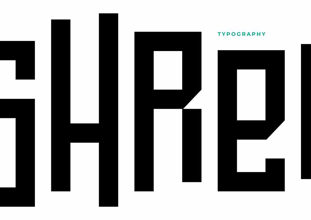
Complementing the iconic logo, a unique and dynamic typography was meticulously crafted to further enhance the brand identity.
